8 Tips & Tricks for the Best Custom Prints
Creating a custom t-shirt design for your business or event is not rocket science, but creativity is a process, and while there is no right or wrong design, there are ways to optimize and get the best results for the biggest impact for your audience. Follow these tips and tricks to create the best custom print for your t-shirt design.
Get inspired
First and foremost, it’s important to nail that perfect idea. If you find yourself stuck on a design concept, take a break, go for a walk, read a book, watch a movie, or talk to a stranger. You may be pleasantly surprised to experience that “aha” moment in the most unexpected of places.
Do some research
If you’re designing a t-shirt that includes a reference or a shout-out to an existing icon, person, joke, or quote, make sure you do some background research. Read up on its history and learn about where that joke came from or who said that quote to really understand and appreciate its context. The last thing you want to create and publicize is something with a questionable (or even offensive) history.
Figure out the best size
Factors like size are probably the last thing on your mind when you’re thinking of other design considerations like colour and concept, but as the saying goes, size matters. Your default decision may be a standard size, but think again. Standard often errs on the larger size, so it may occupy too much space on your t-shirt. Try out a smaller design size and compare the visual impact this may have.
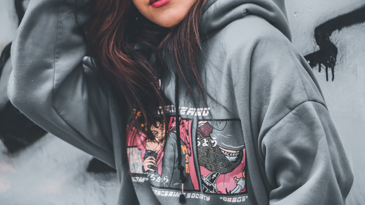
Place it right
Another factor that may slip under your radar is design placement. Believe it or not, placing your image or design in the wrong place can actually make the person wearing the t-shirt look simply awkward. Setting the image halfway between the top and bottom of your t-shirt is actually too low. Imagine a design that hovers over and accentuates your belly… Not attractive! Instead, try placing your design just a bit below the collar, around the chest area. This will allow your audience to get a good glimpse of your design while still having the opportunity see the face wearing the t-shirt.
Choose your font carefully
Font and typography are a unique way to add character to your design. Think of it as the “voice” behind the words that you’re conveying. We’ve said it before and we’ll say it again. Typography can have a big impact on the look and feel of a t-shirt design. Fonts have different personalities. They can be serious or quirky, scary or comical, kiddie or sophisticated. You may also want to choose more than one font for your design to complement each other, depending on which words you want to emphasize. Choosing the wrong font can actually take away from your message and design quality. Make sure you explore different fonts to see which one “speaks” to you.
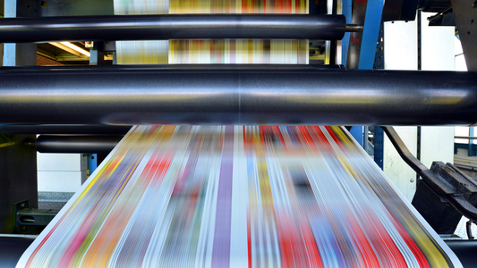
Get savvy with the technical stuff
As a creative mind, the technical stuff may intimidate you, but we can’t emphasize enough the importance of image quality and resolution to acquire the best results. If your image doesn’t have enough “dots per inch”, or dpi, it will come out pixelated and unclear. Opt for images that are at least 200 dpi or more to ensure the clearest image quality for your t-shirt design.
Colors, colors, everywhere
Well, maybe not everywhere. Depending on your budget and the printing method that you choose accordingly (DTG vs. screen printing), you may have to work around some limitations with colors. If you’re using DTG printing, you do have the liberty to explore a wider variety of colors. But depending on your design, selecting fewer colors may be more visually appealing (and less tacky). Aesthetically, using too many colors may also take away from your message or from the design itself. Make sure you also consider the color of your fabric and test how the ink will show up on your fabric color. Contrast is an important consideration as well. You want to make sure you don’t select a dark ink color for a dark t-shirt fabric, or your design may get lost. The best contrast is created with opposites: light ink over dark fabric, or dark ink over lighter colored fabrics.
Keep it simple
With DTG printing and endless options with design complexity, it may be tempting to project all your inspiration and creativity onto one design. Be careful not to overwhelm your design, though. Sometimes less is better. You don’t want your audience to have to work hard with their eyes and brain to process all the content in your design.
If you follow all of these tips and tricks, you’ll be sure to create the perfect design for your custom t-shirt. If you need help through this process, contact A2Z Printing – we’ll work with you to bring your vision to life.
Tags:
Previous
How to Design a T-Shirt: The Ultimate Guide
Next
Cost-Friendly Holiday Gift Ideas for your Clients or Employees
Related Articles
What’s the “stitch” on embroidered hats?
Mar 06 2024
How long do DTF Transfers last?
Sep 15 2023